Context
LPPI had rigorous data on how climate and health risks — extreme heat and air pollution — fall unevenly on California's Latino neighborhoods. Unfortunately, rigorous data doesn't move policy on its own. Researchers can easily parse dense tables; but what about the advocates, organizers, and legislative staff who actually drive change?
The design challenge was legibility under pressure: make a neighborhood's disparities clear to a non-researcher in under a minute, without diluting the research.
My role
I was the sole designer on an eight-person team, owning the interaction and visual design of both the interactive California county map and every county factsheet. I worked closely with our developer through design handoff, contributed to the survey design used to validate the factsheets, and led the integration of stakeholder and user feedback across every iteration.
Process
The experience. An interactive map of California counties. Selecting a county surfaces two infographic-style factsheets with that county's data, deliberately contrasting Latino and non-Latino White populations on the chosen metric — extreme heat or air pollution. Final scope: 24 factsheets (23 counties plus a statewide sheet), each produced for both topics.
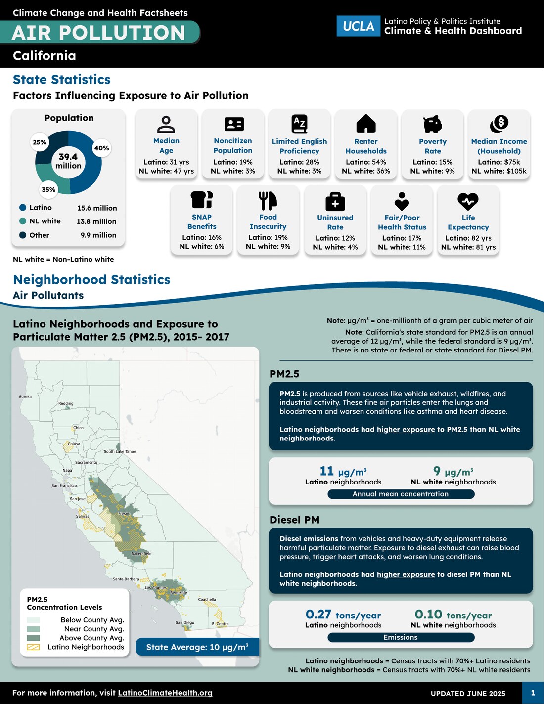
Validation. We ran a Qualtrics survey with the internal team and policymakers to test whether the factsheets communicated clearly. I helped shape the survey and translated what came back into the next round of design.
The core problem — restraint. Early factsheets were text-heavy to the point of drowning the numbers, which were the whole point. Across iterations I cut copy aggressively and rebuilt the visual hierarchy so the statistics carried the weight — using size, color, and directional indicators to steer the eye to what mattered. This meant genuine editorial tradeoffs on both sides: researchers had to re-write and even remove very carefully written copy, and I dropped graphs and visuals of my own, all to prioritize and fit the essential data legibly in a fixed space. And facilitating that negotiation — helping a research team let go in service of the reader — was as much of the work as the design itself.
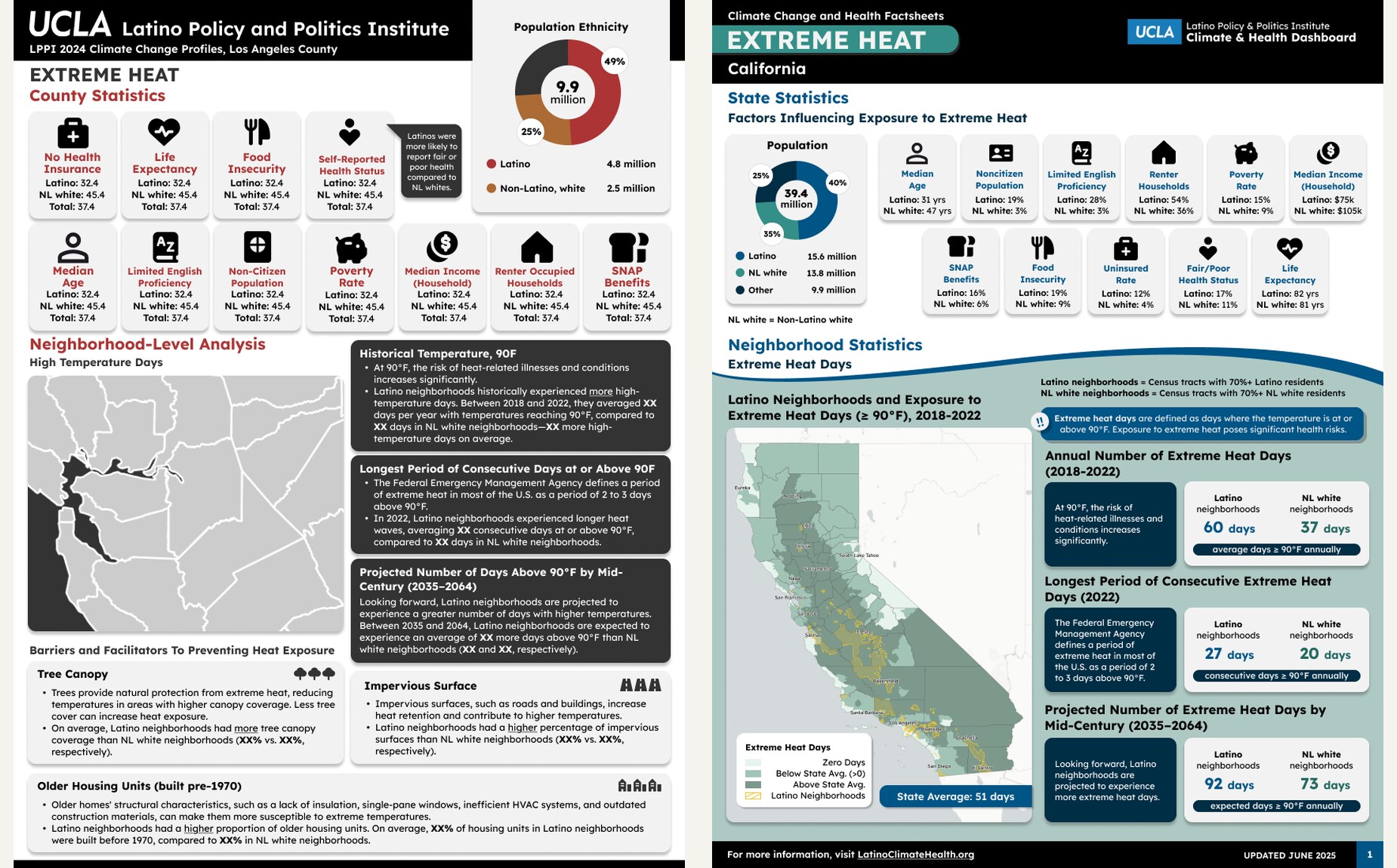
Iteration as system-building. The flagship extreme heat factsheet went through 10 rounds of revision, because it was effectively inventing the template. That investment paid off: air pollution mostly reused the established pattern and needed only 4 rounds, and the dashboard itself took roughly 4. The early grind and frustrations produced a reusable system, not just a single deliverable.
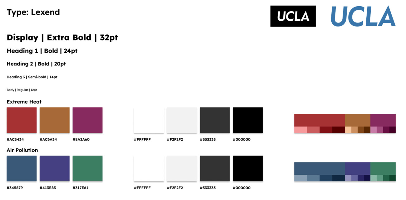
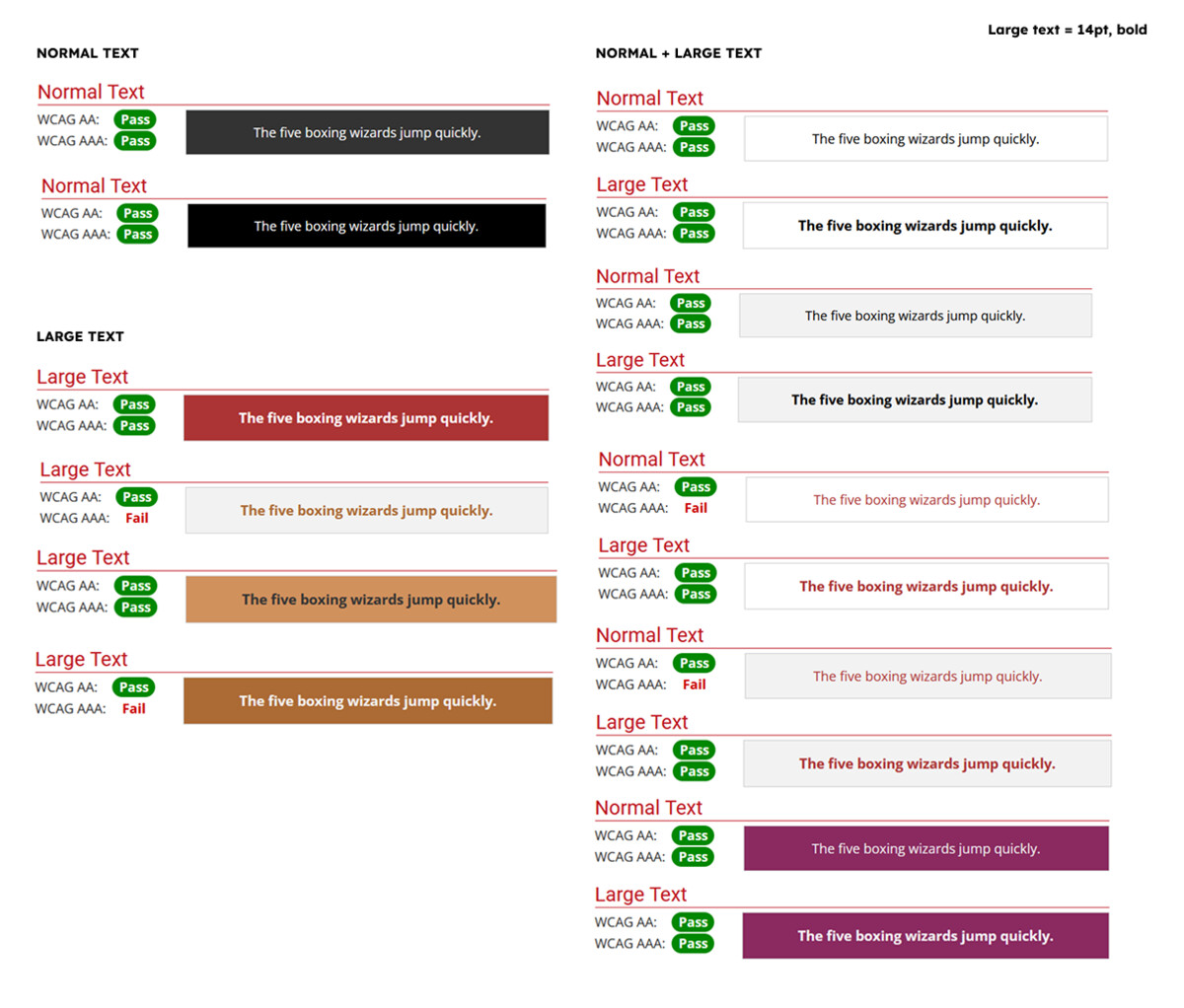
A late curveball on color. The palette I'd designed used two distinct color families — one per topic — so extreme heat and air pollution read as different chapters at a glance. It went through 4 rounds of revisions and passed WCAG contrast testing before it was approved, and persisted through another six rounds of design revision. Then, with under a month to the deadline, leadership decided it read as too colorful and asked for a single, more subdued green-and-blue palette shared across both factsheets. It wasn't the direction the team or I would have chosen — I still think distinct palettes served the reader better — but the constraint was real, so we made the shift work. Thankfully, with reusable Figma color styles, swapping the palette across every factsheet was a near-instant global change instead of editing each sheet by hand.
A shifting brand. Partway through, the dashboard also moved from sharing its parent initiative's branding to standing up its own visual identity. Re-skinning the system to a new brand while factsheets were still in flight was exactly the situation where reusable Figma styles and components earn their keep.
Outcome
The dashboard launched publicly on June 24, 2025, billed as the first tool of its kind to provide Latino neighborhood-level climate-and-health data across California. It surfaced stark, actionable disparities — for example, that Latino neighborhoods are roughly twice as likely to face poor air quality and asthma-related ER visits compared with non-Latino White neighborhoods.
- Analyzed in a peer-reviewed Health Affairs article (2026; 45(5): 570–579).
- Presented at NALEO's 43rd Annual Conference.
- Used in LPPI's 2026 Policy in Action Summit and community "policy plática" convenings to ground advocacy discussions.
- Reached 6,000+ users in its first year.
- Acknowledged by name in the dashboard's official Technical Documentation for the factsheet and dashboard design.
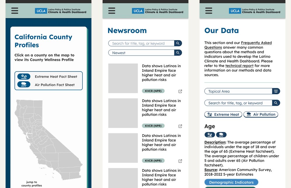
Follow-on work included a mobile prototype, event stickers, a policy toolkit, and a vertical conference banner. I designed the mobile version on a proper auto-layout and component system in Figma — applying what I'd just finished learning in Google's UX Design Certificate — which made it noticeably more rigorous and maintainable than my original design files for the web build.
Reflection
Design systems from day one. If I could do it over, I'd establish a proper Figma component and color-token system at the start. I only did this well on the later mobile prototype — after completing Google's UX Design Certificate — and the color-scheme rework is exactly the kind of pain a token system prevents.
Test the whole product, not just the artifact. Budget and timeline resulted in the prioritization of the fact sheets. However, I would have liked to run usability research on the website and map interaction, not only the factsheets, since users engage with both.
Facilitation is design work. Managing the tension between researchers' desire to preserve their writing and the constraints of a legible page was as consequential as any single visual decision — and something I got measurably better at with each round.