At a glance
What I found, and what I changed.
| Finding | leads to | Design response |
|---|---|---|
| No difficulty shown while browsing tabsusability test, contextual inquiry | A difficulty filter in search | |
| Couldn’t find where to upload a cover videousability test | A guided tutorial for the Shots feature | |
| No way to exit the tutorial or close helpwireframe test | Explicit close controls on both | |
| Wanted to sort resultswireframe test | Sorting by relevance, alphabetical order, and newest |
Before · 2022
After · Redesign
The problem
A huge library behind an interface that hadn’t kept up.
Ultimate Guitar is where a lot of people go for guitar tabs and chords. By 2022 it had been around for more than two decades and had an enormous crowdsourced library, but the site itself had barely changed. The interface was dated, and features beyond the tabs, like requesting a tab or sharing a cover video, were easy to miss and confusing to use.
I use the site, so the frustration was firsthand. My question was: where does the site get in the way of musicians learning new songs? The goal was to keep it recognizably Ultimate Guitar while making it easier to find the right tab and approachable enough that people would try the other features, so they spend their time playing instead of fighting the website.
Who it’s for
Musicians learning songs, with varying comfort with technology.
Ultimate Guitar mostly serves people who already play and use tabs to learn new songs, from hobbyists to working musicians. I set out to design for that range, with extra attention to people who aren’t comfortable with technology, since the site’s dated, cluttered interface hit them hardest.
The research sharpened that picture. My contextual inquiry participant had taught himself guitar and drums over about 8 to 10 years. He knew exactly what he wanted from a tab, and his biggest frustrations were time spent searching, ads, and paywalls. As I note later, my design drifted toward total beginners anyway, and that gap is one of the biggest things I’d do differently.
Role
Solo, from first evaluation to final pitch.
UCLA’s DH 110 was a 10-week course that taught the UX process by doing it. For most of us, me included, it was our first practical exposure to UX. Each student redesigned an app or website of their choice, and I did every part of mine:
- Research: heuristic evaluation, a moderated usability test with my own script and questionnaires, and a contextual inquiry.
- Synthesis: personas, empathy maps, scenarios, and journey maps.
- Design: low-fidelity wireflows, a color and type system, and a high-fidelity interactive prototype in Figma.
- Testing and communication: a wireframe test, a cognitive walkthrough, and a final pitch as a web document and recorded video.
The redesign
Two tasks, rebuilt around what the research found.
The prototype focuses on the two problems my research surfaced most clearly:
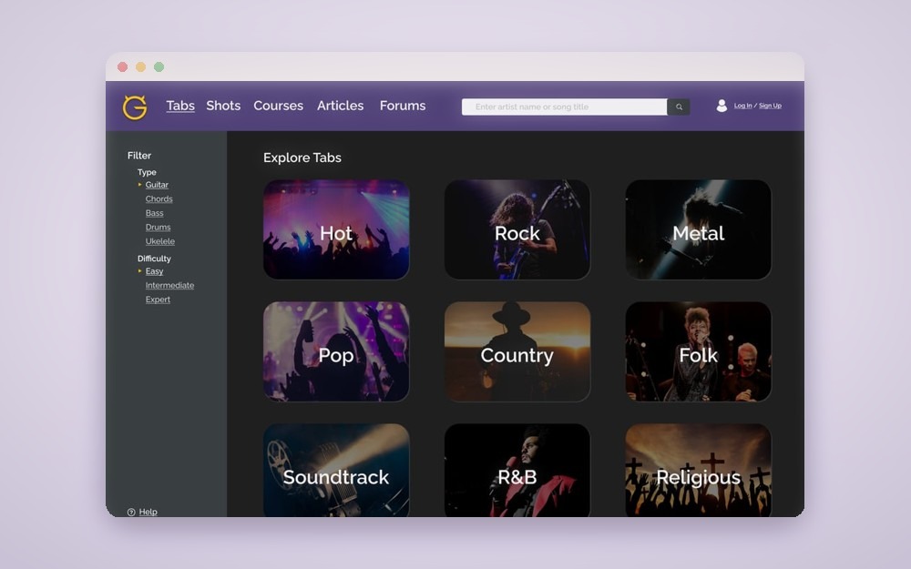
- Finding a tab you can actually play. Search for a song, filter results by difficulty and tab type, and switch between a song’s chords and tabs. This answers the biggest gap from testing: while browsing tabs, the site showed a star rating but nothing about difficulty, so you had to open tabs one by one to find out.
- Learning the Shots feature. Find Shots, Ultimate Guitar’s space for user cover videos, and step through a short guided tutorial, including where to upload your own video. This answers the most confusing flow in testing.
Across both, I kept the site recognizably Ultimate Guitar while modernizing the color palette and simplifying navigation. I deliberately left out a login screen: sites that force you to sign up before exploring push people away, and the usability problems were more urgent.
Research
Three methods, each one checking the last.
1. Evaluating what’s already there.
I started with a heuristic evaluation, scoring Ultimate Guitar against Songsterr, a cleaner competitor, across Nielsen’s ten usability heuristics (severity 1 = minor, 3 = major). It surfaced 12 usability problems. (One small validation: a week after I recommended that Songsterr mark its paywalled features with an icon, Songsterr added exactly that.) The most severe problems on Ultimate Guitar: you couldn’t tell where you were on the site, several flows dead-ended with no clear way back, and nothing signaled what was locked behind the paywall until you hit it.
| Heuristic | Sev | Finding & recommendation |
|---|---|---|
| 01Visibility of system status | 2 | Tab transitions are quick, but it's hard to tell where you are on the site. Fix: highlight the active tab and add a breadcrumb path. |
| 02Match with the real world | 1 | Tab names are self-explanatory and the icons are standard. Fix: good as-is. |
| 03User control & freedom | 3 | Selecting one tab type collapses the others; "Publish Tab" and "Pro" jump to a different page structure with no clear way back. Fix: keep the other types visible, and hold the structure (or open those in new tabs). |
| 04Consistency & standards | 1 | Color and layout are consistent and standard; the Shots background breaks from the rest of the site. Fix: tone down the harsh yellow and match the Shots background. |
| 05Error prevention | 3 | Member- and subscription-locked tabs aren't flagged before you click them. Fix: add a lock icon and make the Pro requirement clear up front. |
| 06Recognition over recall | 1 | Tab submission guides you step by step, and tab actions stay pinned while scrolling. Fix: good as-is. |
| 07Flexibility & efficiency | 2 | Strong shortcuts (edit / playlist / favorite / PDF, version switching, Top Tabs, history), but Shots can't be uploaded from its own tab and doesn't signal scroll or arrow-key navigation. Fix: add a recommendations tab; let users upload and navigate Shots from the Shots tab. |
| 08Aesthetic & minimalist design | 2 | Simple to navigate, but ad placement is distracting and the Forums list every active user. Fix: rework the color scheme, drop the active-users list, and redesign the dated Forums. |
| 09Help users recover from errors | 1 | Search handles typos and empty results, and locked content is clearly explained on click. Fix: minor cosmetic room. |
| 10Help & documentation | 2 | The footer has About / rules / support, but there's no per-tab explanation and the Forums are unintuitive. Fix: add a short blurb per tab and a Forums help section. |
Materials: Full heuristic evaluation
2. Watching someone actually use it.
An expert review only gets you so far, so I designed a pilot usability test around the three most severe problems and ran it remotely over Zoom. The participant thought aloud through three tasks, each broken into steps:
- Find a challenging tab for Laufey’s “Like The Movies,” check its difficulty, and find the hardest version.
- Request a tab for a song that isn’t on the site.
- Find other users’ cover videos, scroll to the end, and find where to upload your own.
Before the tasks, he rated how easy and trustworthy the homepage looked. After them, he rated each task’s ease and time, answered the ten System Usability Scale statements, and picked five words from a set of product reaction cards to describe the site.
What it found:
- A problem the heuristic evaluation missed. He found the star rating easily, but that’s a satisfaction rating. Nothing in the search results showed how hard a tab was; difficulty only appeared after opening a tab.
- Features in the wrong place. He looked for tab requests under Tabs. They live in Forums, which he found intimidating.
- A dead end. He couldn’t find where to upload a cover video, and scrolling through the videos took several tries.
- A rough first impression. He found the homepage slightly intimidating and untrustworthy.
One honest limit: it was a single-participant pilot, and he was a young adult, not the middle-aged players I had first planned to focus on.
Materials: Moderator script & survey · Usability test write-up
3. Watching how a musician really learns.
For the contextual inquiry, I asked a musician to pick a song he wanted to learn and show me his process over a 30-minute screen share. He searched for tabs, opened Ultimate Guitar as the first result, and moved on almost immediately: its chords-over-lyrics format wasn’t what he needed. He settled on Songsterr, praising its difficulty indicator, playback, and looping.
His process confirmed the difficulty gap independently, and his explanations went further:
“…working with the instrument, not working with learning the instrument.”
Contextual inquiry participant, self-taught guitarist and drummer
- Tools should stay out of the way. He chooses resources that are free and simple.
- Search time is a dealbreaker. He gives a tab search “10 minutes max” before giving up and learning by ear.
- Difficulty only helps if it means something. Star ratings for difficulty are subjective, since “different people have different skill levels.”
- Versions help people choose. He wanted to compare versions of the same song and “choose an easier version of the song as you’re learning it.”
- Language matters. The popular Japanese song he chose had no Japanese lyrics on the site.
Materials: Contextual inquiry write-up
Pulling it together. Across all three methods, I landed on three priorities, all ahead of the paid Pro tier: simplicity, support for learning beyond the chord sheet, and open access. As I wrote at the time, without an appealing free version of the site, the Pro version wouldn’t succeed.
How the design evolved
Personas
Personas: two ends of the user range.
I built two personas, each with an empathy map, a scenario, and a journey map. Bradley is a 35-year-old chef learning acoustic guitar who wants the process to feel painless. Liam is a 52-year-old professional keyboardist who is tech-averse and just wants lead sheets he can pull up fast. Designing for both kept the full range of comfort with technology in view.
Bradley · Persona
Bradley · Empathy map
Bradley · Journey map
Liam · Persona
Liam · Empathy map
Liam · Journey map
Materials: Personas and scenarios write-up
Lo-fi
Lo-fi: paper wireflows, tested.
I sketched both tasks as hand-drawn wireflows, then tested them with someone new to music learning: find the easy guitar tab for Ed Sheeran’s “Happier,” switch to the chord sheet, and open the Shots tutorial. They finished both tasks without confusion, and their three pieces of feedback each became a revision:
| Feedback | leads to | Revision |
|---|---|---|
| Wanted to sort artists alphabetically | Added sorting by relevance, alphabetical order, and newest | |
| Unclear how to close the help window | Made closing it explicit, instead of only clicking outside | |
| No way to leave the tutorial partway through | Added a close button to the tutorial overlay |
Materials: Low-fi prototype write-up
Mid-fi
Mid-fi: a visual system with contrast checks.
I mocked up three typefaces (Montserrat, Raleway, Work Sans), three corner radii, and light and dark modes, then ran an impression test. The participant preferred dark mode and the least rounded corners, which matched the search bar. They leaned toward Work Sans but liked Raleway too, and I chose Raleway for its readability across sizes. A contrast check caught the header text failing WCAG AAA at 6.22:1, so I adjusted the color until it passed at 7.8:1. A UX designer friend also reviewed the layout, and the revision that followed removed distracting drop shadows, enlarged and centered text, darkened the genre panels for readability, simplified the login area, and evened out the spacing. For color, I made purple the main color and kept Ultimate Guitar’s signature yellow for small accents, so the site still felt like itself.
Fails AAA · 6.22:1
Passes AAA · 7.8:1
Materials: Interface design write-up · Screen design tests (Figma) · Impression test video
Hi-fi
Hi-fi: an interactive prototype, and a walkthrough I misread.
I built both tasks as an interactive Figma prototype and ran it through a remote cognitive walkthrough. The reviewer treated the prototype like a tutorial site. They were also outside my target age range, so at the time I decided they had misunderstood what Ultimate Guitar was for and didn’t change anything.
Looking back, the reviewer probably read my design correctly. I had added a guided tutorial, built a persona with no music background, and tested my wireframes with a beginner. The design was signaling “learning site,” and I treated the reviewer’s confusion as their mistake instead of a finding.
The reviewer also suggested showing search results as buttons instead of links. I worried buttons could look dated and proposed a middle ground: rounded panels, like Reddit’s. I also weighed renaming menu labels for clarity against keeping Ultimate Guitar’s branding.
Materials: High-fi prototype write-up · Cognitive walkthrough evidence
Outcome
A researched proposal, start to finish.
This was a student project, not a shipped product. What it produced:
- A redesign that traces back to evidence. The difficulty filter, the sort controls, and the Shots tutorial each answer a problem I observed in testing.
- An interactive Figma prototype of both core tasks.
- A pitch, as a web document and a recorded presentation, walking through the reasoning and demoing the prototype.
▶ try the interactive prototype ↗
Materials: Pitch write-up · Pitch video
What I learned
One observed user can beat an expert pass.
Watching one person hunt for a difficulty rating that wasn’t there told me more than the whole heuristic evaluation did. That’s when the methods stopped being a list of terms and became something I could actually run.
Understand why something exists before simplifying it.
I flattened the site’s filtering to make it simpler. My redesigned filter offered only tab type and three difficulty levels, and dropped the genre, decade, and version choices people use to narrow a catalog that size. People needed that filtering, especially to choose between crowdsourced versions of the same song, and my own participant said so. Now I’d keep the capability and make it friendlier: sensible defaults like showing the highest-rated version first, basic filters up front with advanced ones a click away, and difficulty and rating shown on every version so people can compare at a glance. The same goes for ads: I left them out of my mockups entirely, but a free site like Ultimate Guitar depends on them, so a real redesign would need to plan where they go.
When feedback seems off, ask what in the design caused it.
I dismissed the cognitive walkthrough because the reviewer treated my prototype like a tutorial site. The reviewer was reading what I’d designed. The same pull shows up in my personas: my research participant was an experienced player, but I designed toward total beginners anyway.
Define users by what they do.
I defined my target user by age, middle-aged men, and then neither my pilot participant nor my walkthrough reviewer fit. If I redid this, I’d define users by experience and goals, like “plays already and learns new songs from tabs,” because that’s what actually shaped how people used the site. Every study also ran with a single person, which is normal for a class pilot, but now I plan who I need to hear from as carefully as what I’ll ask them.
Process first, craft second.
Looking back four years later, I don’t stand behind every design decision or the polish of the final screens. But this project gave me the process, and seeing the gap between knowing the process and executing it well is a lot of what I’ve been working on since.